Why I painted a boring beige background for Headshots

I think about a lot of things most people never spend a second considering. One of those things is backdrops. I actually love painting backgrounds.
I can lose an embarrassing amount of time looking at colors, textures, painted canvases, paper rolls, hand-painted masterpieces, and every new trend that pops up in the photography world. As a photographer, it's easy to get excited about creating something different. After all, bringing a unique look to the table is part of what makes creative photography fun.
But there is always a balancing act.
My job isn't just to create a portrait that looks good today. My job is to create a portrait you'll still love years from now.
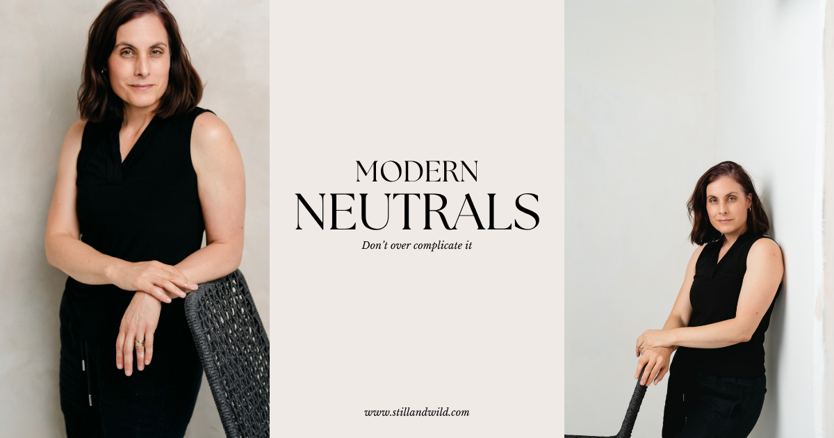
That's where this simple beige backdrop comes in.
At first glance, it almost feels too simple. No dramatic texture. No bold color. No trendy design element screaming for attention. Just a soft, neutral background.
And honestly, that's exactly why I love it.
The beauty of a simple backdrop is that there are no distractions. Your eyes go exactly where they're supposed to go: to the person in the photograph.
Not the backdrop. Not the color trend of the year.Not some design choice that will feel dated six months from now.
Just you…. looking fabulous. I love this color and choose this color because it is so complimentary to skin tones.
When someone needs a professional headshot, whether it's for LinkedIn, a company website, marketing materials, speaking engagements, or social media, versatility matters. A portrait should be able to move from platform to platform without feeling out of place. That's much harder to do when the background becomes the star of the image. Beige is also great because it lives somewhere in the mid tones. Not stark white and not dark either.
A simple backdrop gives your portrait something incredibly valuable: shelf life. Five years from now, I don't want you looking at your headshot and thinking, "Wow, that was definitely taken in 2026." I want you looking at it and thinking, "That still feels like me."
That's why sometimes the most creative choice isn't adding more. It's removing everything that doesn't matter.
A great portrait doesn't need distractions. It needs good light, genuine expression, and a background that supports the story instead of competing with it.
So while I love experimenting with new ideas and creating unique looks for the right project, you'll often find me returning to this simple beige backdrop.
Not because it's boring. Because it works. And sometimes the smartest choice is the one that quietly lets you shine.