
The Smartest Part of a Headshot Has Nothing to Do With Lighting
Most people never think about cropping when they get a headshot taken. They are thinking about outfits, expressions, hair, smiles, or whether they feel awkward in front of the camera. Totally fair.
But honestly, one of the biggest things that determines how valuable your headshot becomes over time is flexibility. How many ways can you use it and how many places?
That is one of the main reasons I photograph organization and corporate headshot days in a horizontal crop instead of a tight vertical one.
You can always create a vertical crop from a horizontal image, but you usually cannot go the other direction.
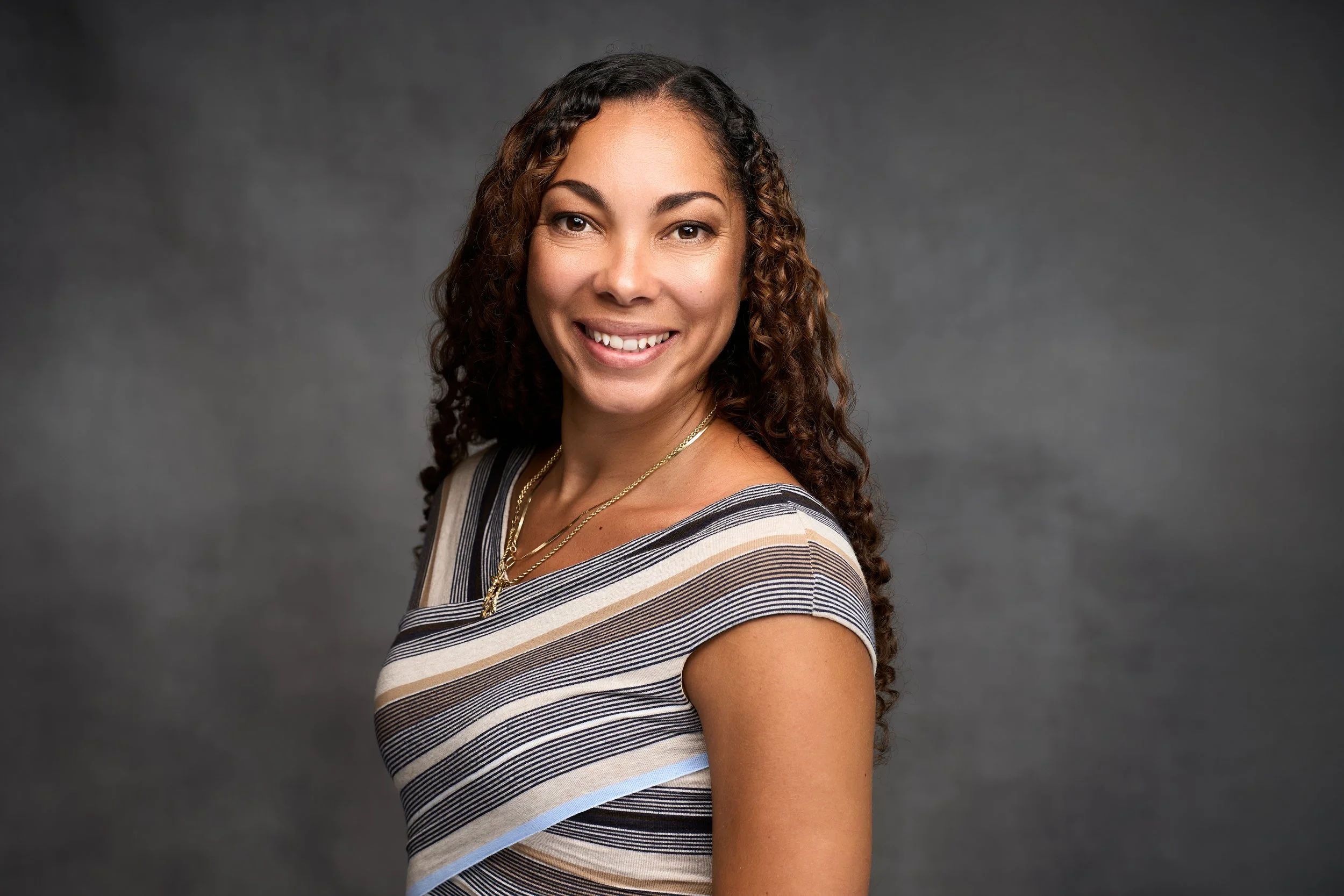
That extra space gives you options. Maybe today you need a LinkedIn profile picture, but six months from now your company redesigns the website and suddenly needs a wide banner image. Maybe your marketing team wants room for text, graphics, or a logo. Maybe you need both a tight professional crop and a wider image for a presentation slide or magazine layout.
I want your images to work in as many places as possible without feeling restrictive. Headshots are an investment, and the more flexibility your files have, the longer they stay useful. Most large organizations are typically only receiving one final headshot per employee, so I want that single file to be as valuable and flexible as possible.
That means creating an image that can work across LinkedIn, websites, marketing materials, email signatures, presentation slides, press releases, recruiting graphics, and social media without constantly running into crop limitations.
A well-composed horizontal image gives organizations options. And when you are investing in headshots for an entire team, those options matter.
Most website headers, staff directories, hero banners, and marketing layouts are designed in wide formats. If I shoot too tightly or vertically, designers and marketing teams immediately run into limitations. They start awkwardly cropping foreheads, cutting off shoulders, or zooming in too much just to make the image fit their layout. A horizontal composition gives breathing room around the subject so the image can flex into multiple uses without looking cramped.
I also intentionally leave room around the body, especially the shoulders and upper torso, because modern marketing often requires images to be extracted from the background for graphics, advertisements, websites, or social media designs.
If your company designer drops your image into Canva to create a banner, flyer, recruiting graphic, or sponsorship piece, having your full shoulders and body shape intact matters. Tight crops can make extractions awkward and limiting really fast.
By photographing horizontally and giving a little breathing room, I can preserve all the important pieces so your image stays flexible for future marketing use. You may not need that today, but when you do, you’ll be really glad the space is there.
There is also a practical photography reason behind it.
During fast-paced headshot days, people move. Some lean forward, some sit taller, some cross their arms, some shift naturally while talking. Shooting horizontally gives me a little extra room to preserve great expressions without accidentally cropping too tight. I would much rather deliver a confident, relaxed image with flexibility than an overly tight crop that feels restrictive.
Horizontal images also create better consistency across teams. When photographing 20, 50, or even 200 (well… I can only hope..we would be cruising if we did!) employees in a single day, consistency becomes incredibly important. The spacing, alignment, and composition all work together to create a polished and professional final gallery.
And honestly, horizontal images just give people more options.
From one horizontal image, you can create:
LinkedIn profile crops
Website banners
Email signature images
Press release graphics
Podcast thumbnails
Social media graphics
Presentation slides
Recruiting materials
Magazine or newspaper layouts
Team composite graphics
A vertical image usually has one main purpose. A horizontal image gives you options. And in modern branding, options matter.
This is especially important because businesses are no longer using headshots in just one place. Your image might end up on a website, Instagram story, conference screen, sponsorship banner, Zoom presentation, online article, or digital ad. Versatility matters more than ever.
Now, does that mean vertical images are bad? Not at all. If I am shooting an essential headshot session in my studio… I got for a lot of vertical images because I have one person and we are taking many shots.
For senior portraits, personal branding, magazine-style shoots, athletes, and creative sessions, I absolutely shoot vertically too. Those sessions are built differently and usually have more artistic or storytelling goals. But for efficient, professional, scalable headshot days, horizontal simply makes more sense.
At the end of the day, my goal is not just to take a flattering photo. My goal is to create an image that serves people well long after the camera is put away.
And sometimes the smartest decisions in photography are the ones clients never even realize were intentional.

