
Defining Your Brand’s Big Word and What It Should Look Like Visually
Every strong brand has a feeling attached to it.
Often, that feeling can be summed up in one word. I call this your big word.
Confidence.
Calm.
Bold.
Refined.
Approachable.
Your big word acts as a filter. It helps guide decisions about how your brand looks, sounds, and feels.
Whether you define it intentionally or not, it is already influencing your brand. The difference is whether that influence is consistent.
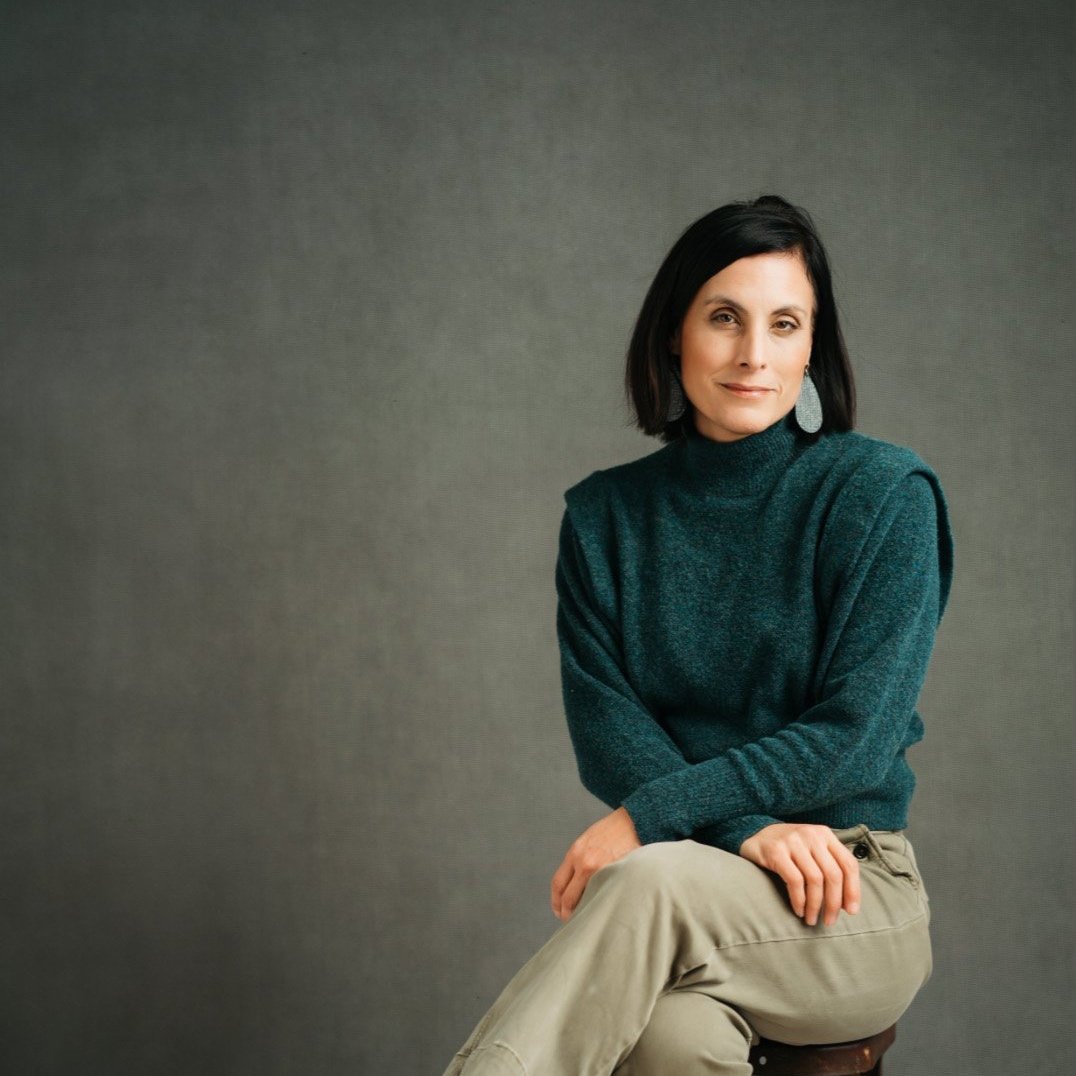
If your big word is confidence, your visuals should support that feeling. Strong posture. Clear eye contact. Intentional lighting. Clean, simple compositions.
If your big word is calm, your imagery should feel peaceful, not chaotic. Soft light. Neutral tones. Space to breathe.
Visual branding is not about trends or aesthetics alone. It is about alignment.
When your visuals match your message, your brand feels cohesive. When they do not, people feel a disconnect, even if they cannot articulate why.
This is why tools like Pinterest boards or inspiration collections are so valuable. Not to copy others, but to recognize patterns. What images consistently feel aligned with your brand? What feels off?


As you collect visuals, you begin to see your big word emerge more clearly. You gain confidence in what belongs in your brand and what does not.
When your visuals and message align, trust builds quickly. People feel like they understand you without needing an explanation.
That clarity strengthens every part of your business, from your website to your social media to your client experience.
How to Use Pinterest to Create an Inspiration Board for Your Branding or Headshot Session
Pinterest gets a bad reputation sometimes. It can feel like a black hole of ideas, comparison, and “I love this but have no idea why.”
But when it’s used intentionally, Pinterest is one of the best tools we have for getting clarity before a branding or headshot session.
I use Pinterest boards all the time with my branding clients. I even use them for single headshots. Not because we need a massive plan for every photo, but because every image still needs direction.
The goal is not perfection.
The goal is alignment.
Here’s how I recommend using Pinterest to create an inspiration board that actually helps your session and makes our clarity call way more productive.
Start With One Big Word
Before you search anything, pause.
Ask yourself this question:
How do I want to be seen?
Not what props you want.
Not what outfit you’ll wear.
Not what background looks cool.
Just the feeling.
Some examples:
Relaxed
Fun
Cozy
Bold
Grounded
Approachable
Editorial
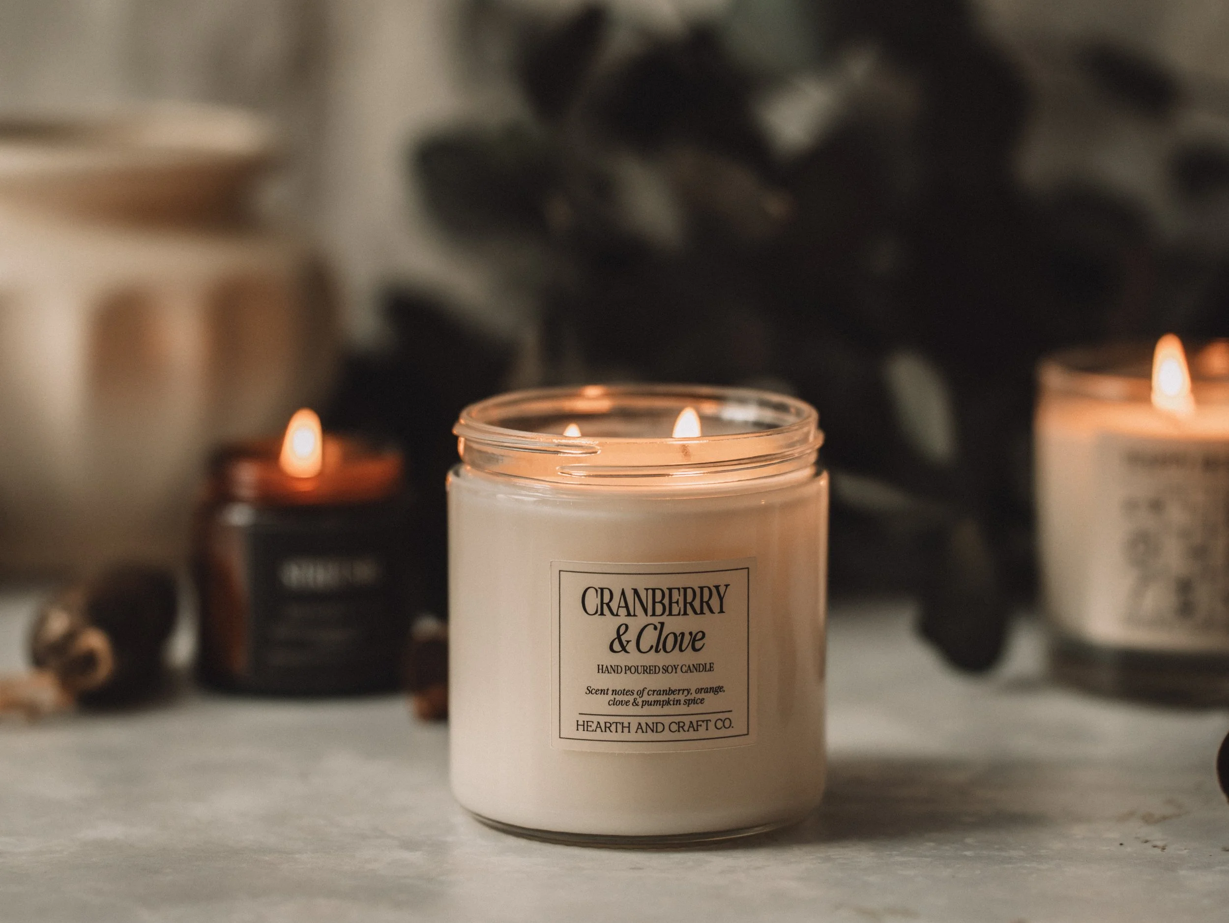
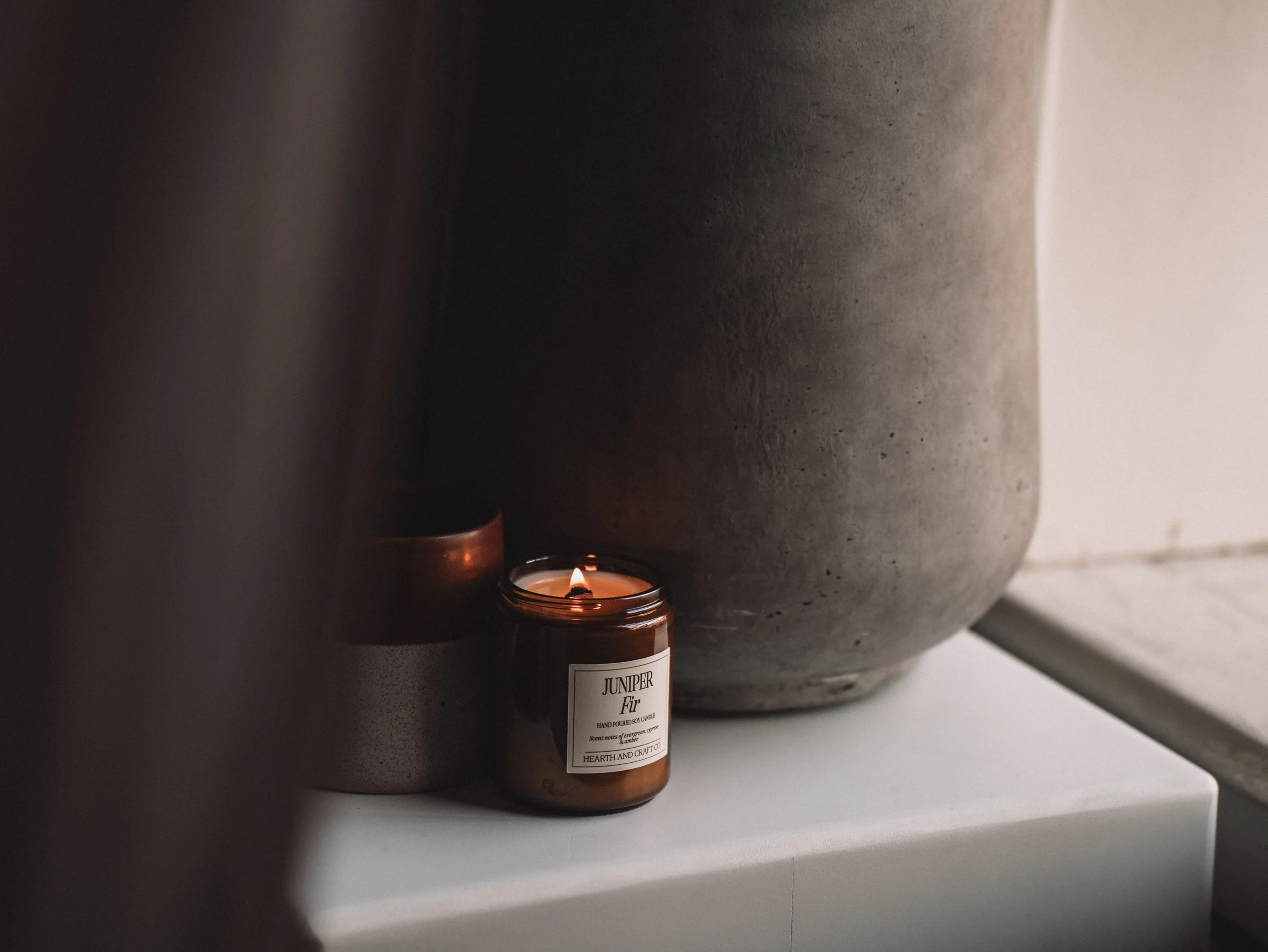
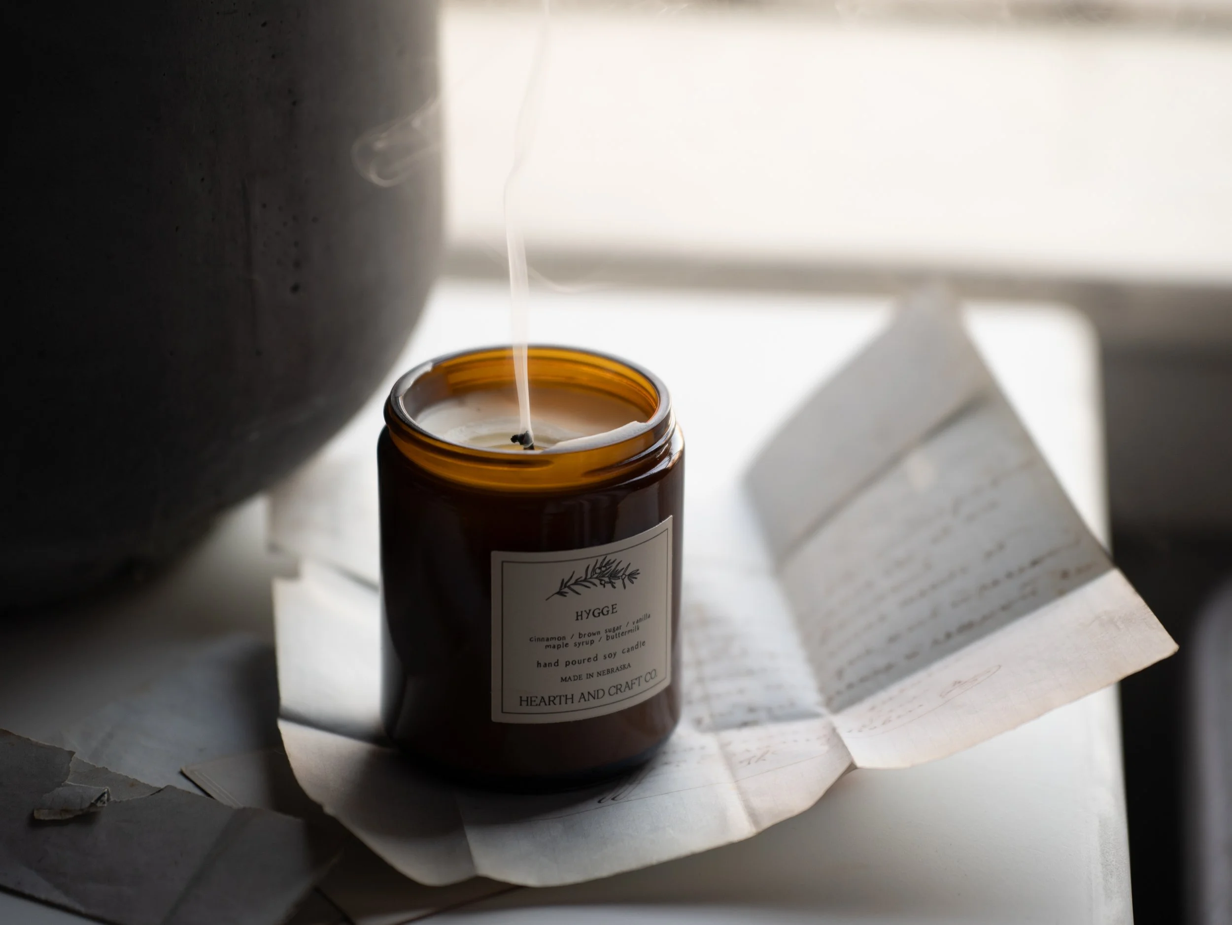
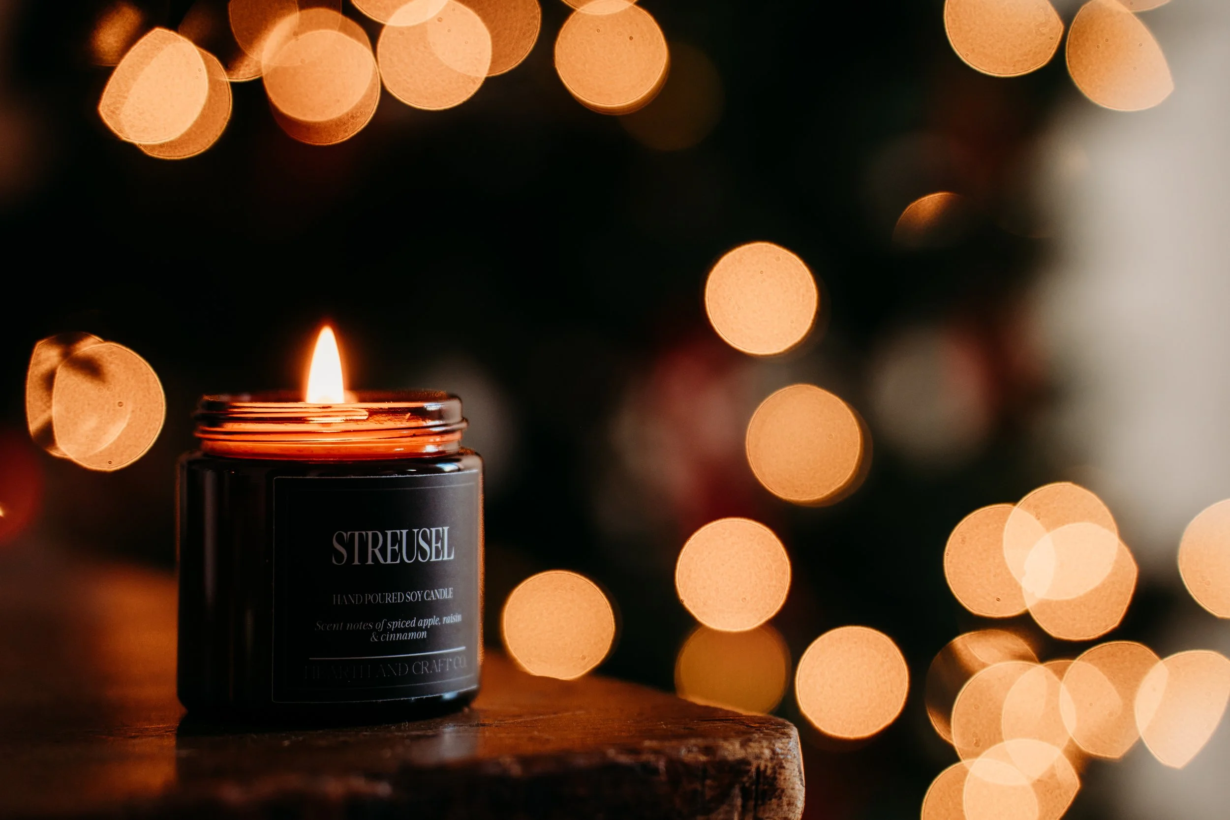
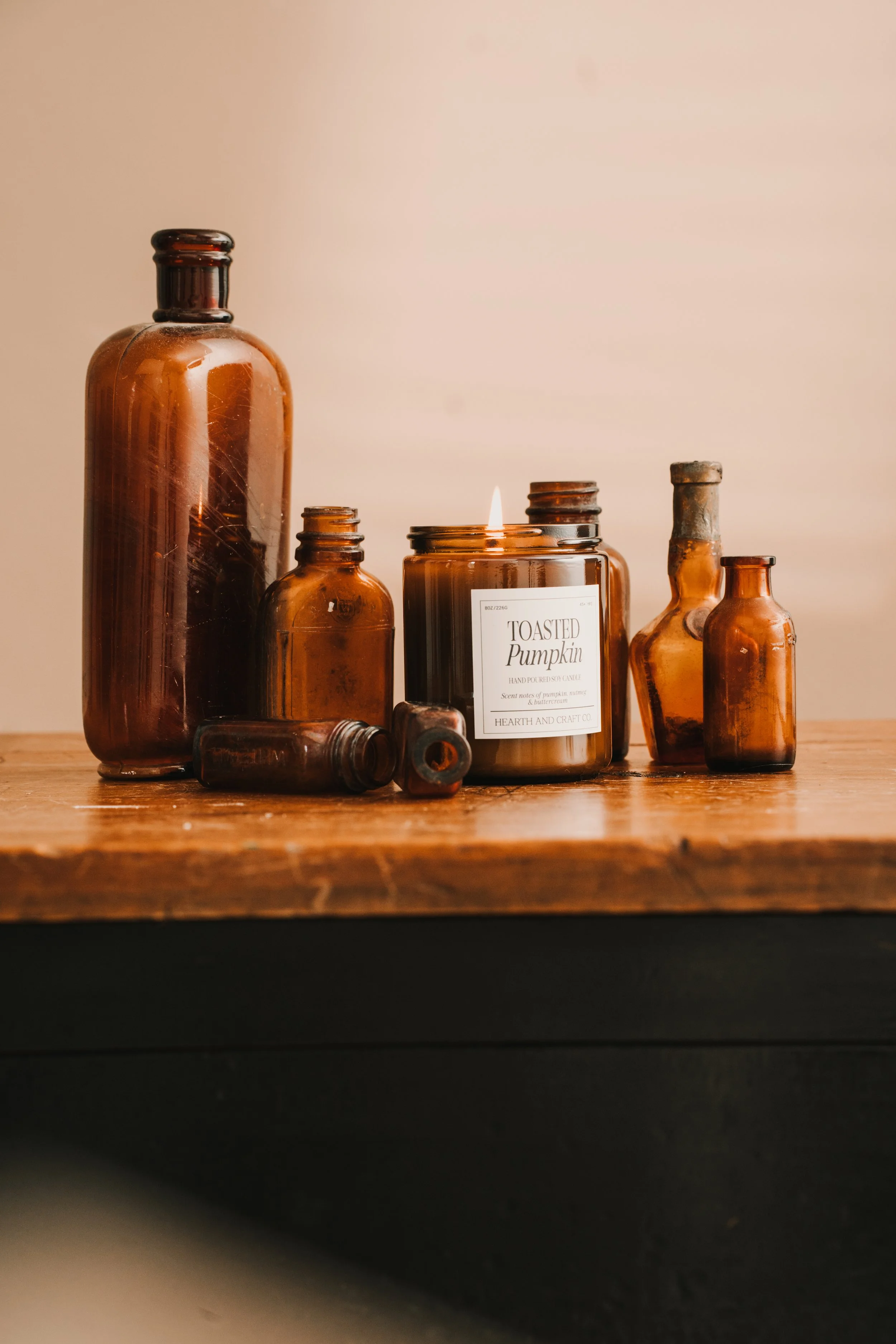
This “big word” becomes your filter. Everything you save should connect back to it in some way. This is something I did heavily with Hearth and Craft Candle Co. Cozy was the word. Once that was clear, everything else fell into place.
Give Yourself Permission to Go Down the Rabbit Hole (Once)
This is the only time I encourage it.
Open Pinterest. Type in your word or a short phrase that supports it. For example:
“Cozy branding photography”
“Relaxed headshots”
“Warm neutral lifestyle”
Scroll.
Pause.
Save anything you are drawn to.
And here’s the key: you do not need to explain why you love it yet.
If you’re drawn to an image, there is something there. Light. Movement. Mood. Color. Energy. We can unpack that later.
Just save it.
Don’t Edit Yourself at First
Your first board should feel a little messy. That’s normal.
At this stage:
Save freely
Ignore duplicates
Ignore practicality
You are collecting patterns, not building a shot list yet.
Once everything is on the board, then the clarity starts to happen.
Step Back and Look at the Board as a Whole
This is where things get interesting.
When you look at the board all together, you’ll start to notice:
Repeating colors
Similar lighting
The same kind of posture or movement
A consistent mood
You’ll also notice what does not fit.
This is the point where I start paring things down with clients. What supports that big word? What feels off? What is just a repeat?
Sometimes I’ll screenshot sections of the board and even pull them into Canva to see the vibe all at once. You do not have to do that, but it can help.
Share the Board Before Your Clarity Call
Once your board feels representative, share it with me.
You can send:
A Pinterest board link
Screenshots
A Canva vision board
This gives me instant insight into where your head is at before we ever talk logistics.
Instead of guessing what you mean by “I want something cozy but elevated,” I can see it.
This Is Where My Job Really Kicks In
Here’s the important part.
Your Pinterest board is not a shopping list.
You might save:
A castle
A vintage sofa
A massive studio with perfect light
Motion you love
Textures you are drawn to
And that’s okay.
My job is to translate the feeling, not recreate the image exactly.
So the conversation becomes:
I know you love this motion. Here’s how we can bring that movement into your session.
I know you love this vintage feel. Here’s how we can create that same warmth without a castle.
I know you love this lighting. Here’s how we can adapt it to your location.
Pinterest shows us the direction. Experience turns it into something achievable.
Why This Makes Your Session Better
When you come into your session with a shared visual language:
We waste less time
We make decisions faster
Your images feel intentional
You feel more confident showing up
Even a single headshot benefits from this. One strong image still needs a point of view.
Final Thought
You don’t need to be good at Pinterest.
You don’t need a perfect board.
You don’t need to explain every choice.
You just need to notice what you are drawn to.
From there, we build something that actually fits you, your brand, and your real world.
If you’re booking a clarity call or branding session, creating a Pinterest inspiration board ahead of time is one of the best ways to set us both up for success.
And yes, this is the one time I’ll encourage you to go down the rabbit hole.
Continue Reading WHY A CONTENT STREAK MATTERS MORE THAN POSTING EVERYWHERE