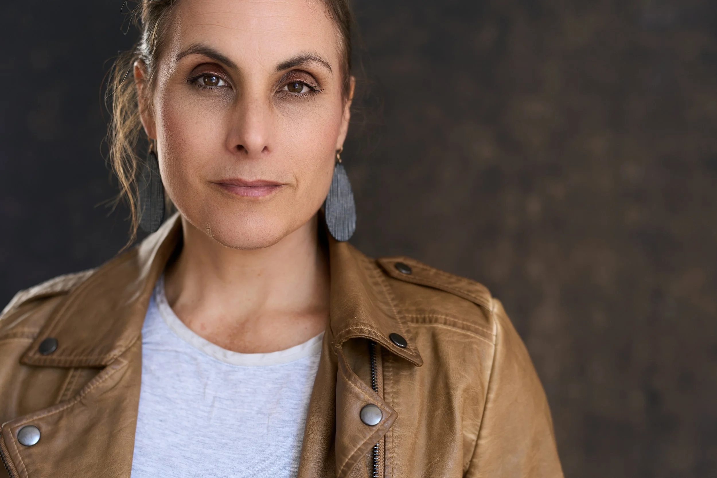
Color Harmony in Headshots: One Jacket, Eight Backdrops
Most people planning a headshot session ask me the same question: "What should I wear?"
It's a good question. But there's a second one that matters just as much, and almost nobody asks it: what am I wearing it against?
So I set up my camera, put myself in front of it and ran an experiment. I was the photographer and the subject. Same caramel leather jacket, same heather grey tee, same slate earrings. The only thing that changed was the backdrop. Eight backdrops, eight different moods.
I'll be honest, getting in front of my own lens wasn't easy. Setting the lights, stepping into the frame, checking the shot, adjusting, stepping back in... it gave me a whole new respect for what my clients go through. It also showed me something I talk about all the time but had never seen this clearly: color changes the story before you say a word.
Here's what I learned, and how you can use it when you plan your own session.
A quick color wheel refresher (no art degree required)
You don't need to memorize anything here. Just three ideas:
Complementary colors sit across from each other on the color wheel. Put them side by side and each one looks stronger.
Analogous colors are neighbors on the wheel. Together they feel calm and cohesive.
Neutrals step back so you can step forward.
My jacket sits in the warm orange family. So does my skin tone, and so do most people's. Keep that in mind, because it explains everything below.
Complementary: blue makes warm tones glow
Blue sits directly across from orange on the color wheel. That's why the light blue and navy backdrops make my jacket and skin look so warm.
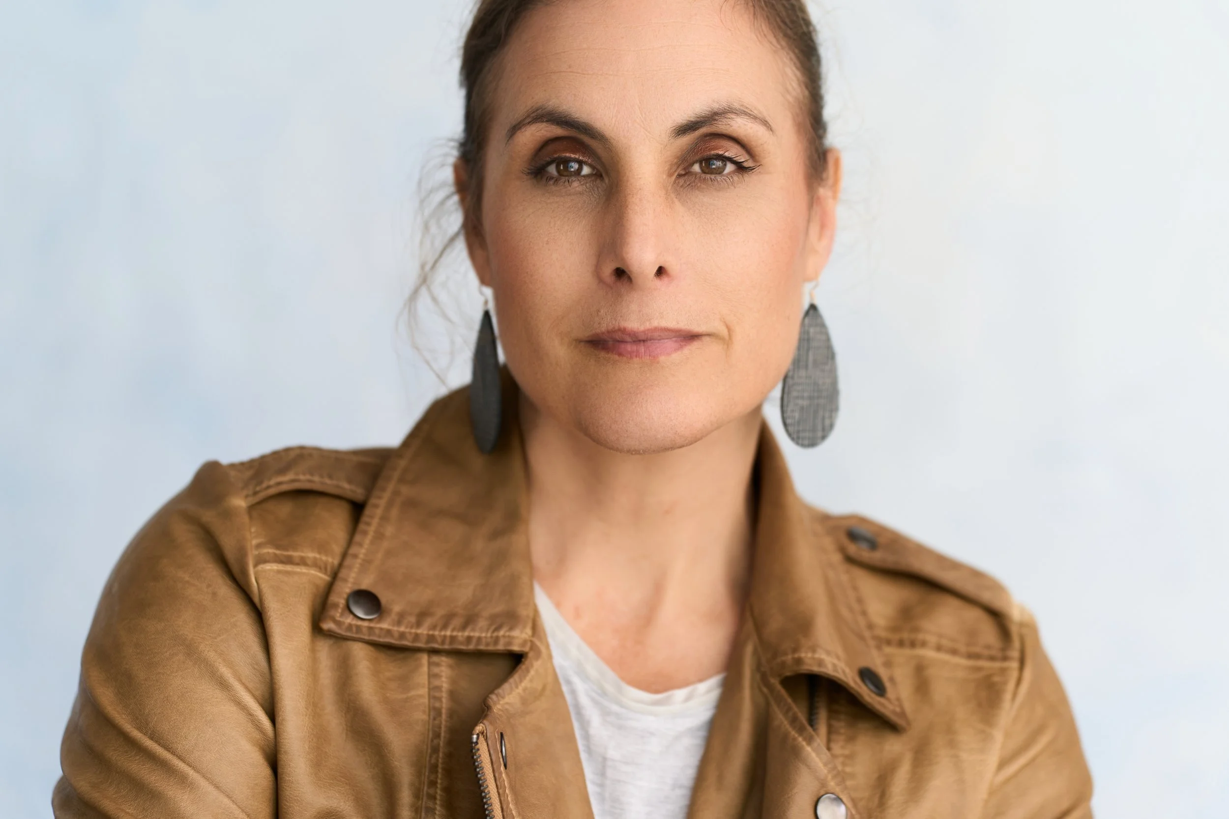
This is the one that surprised me most. The soft sky blue feels fresh, open and approachable, and it made my skin look healthy and bright. It's a great choice if your work depends on people feeling at ease with you: coaches, counselors, realtors, anyone in a helping role.
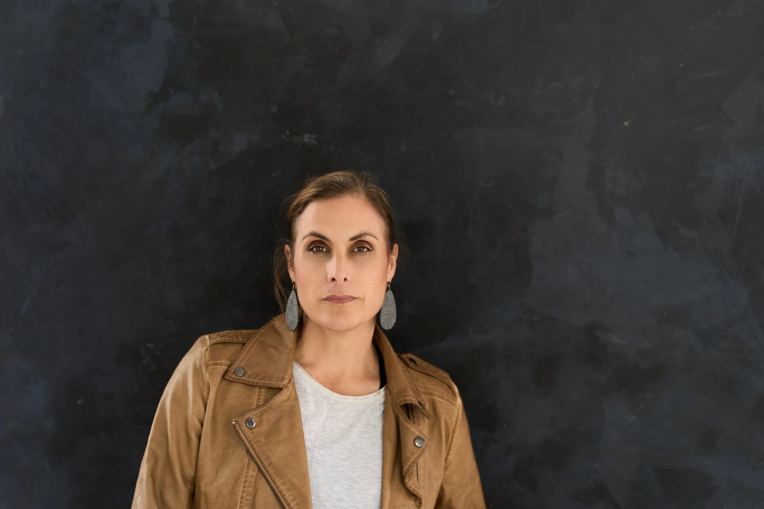
Take the blue darker and everything changes. The navy reads as serious, editorial, a little dramatic. All that dark space frames the face and gives a designer room to add text. My slate earrings pick up the cool tones in the backdrop, which quietly pulls the whole frame together.
Analogous: warm on warm feels grounded
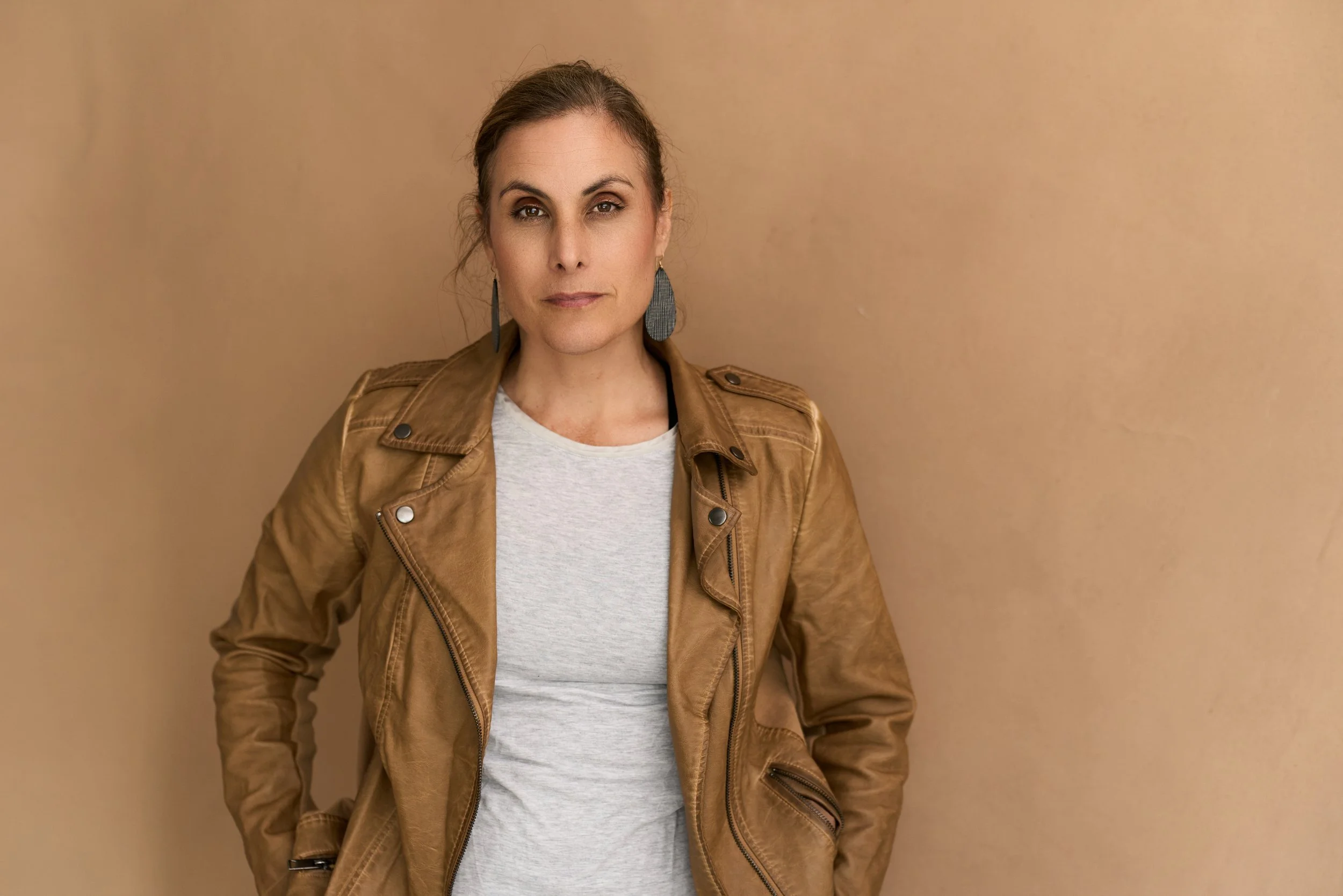
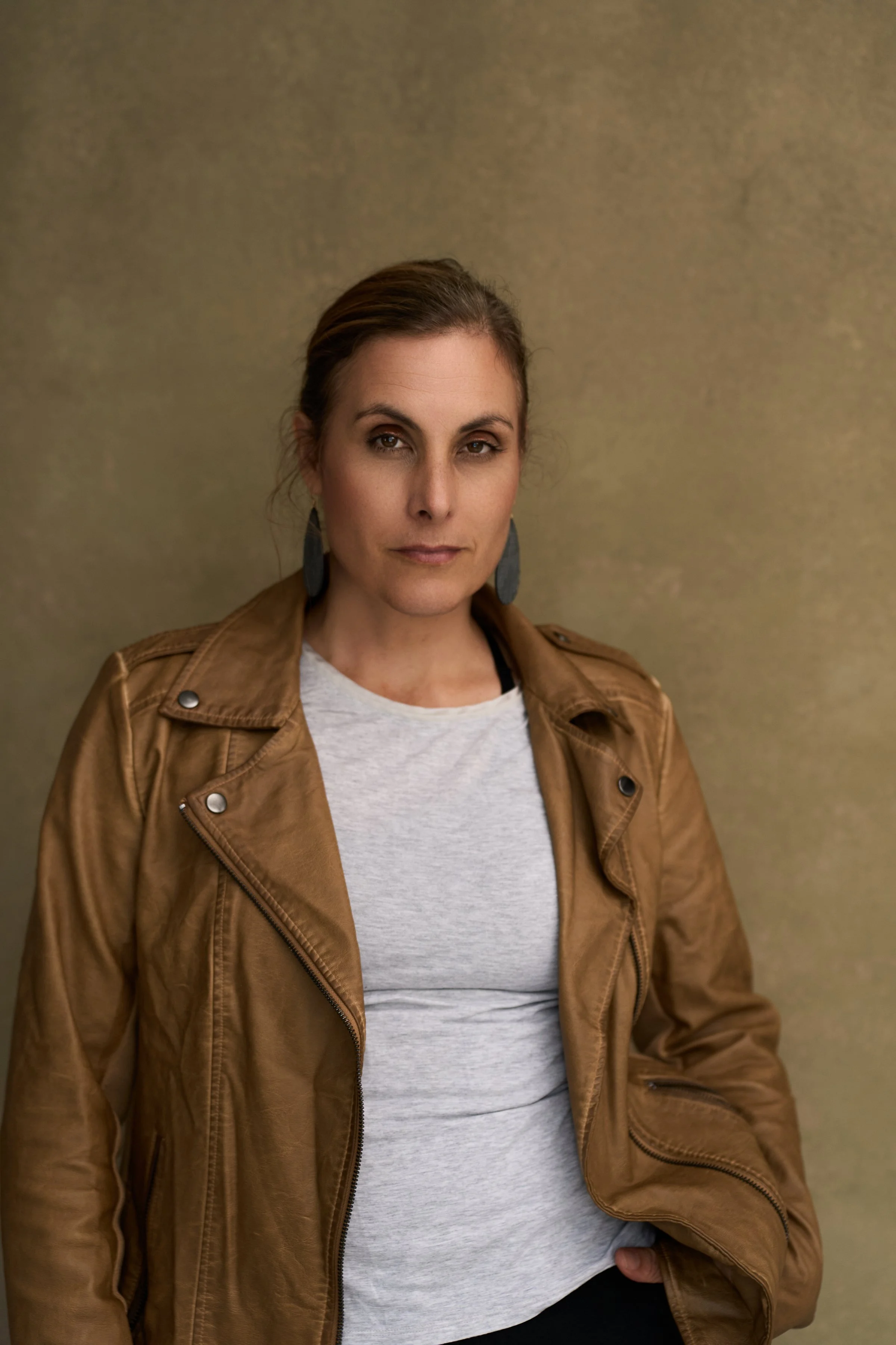
These backdrops share the jacket's warm family, so nothing fights for attention. The result is rich, calm and cohesive, the kind of image that feels at home on a well-designed website.
Olive gold is my favorite of the three. It's earthy and textured, and it gives the jacket a vintage warmth without swallowing it. If I had to pick one image that feels most like me, it might be this one.
Peach is soft and sunny. Because it sits so close to the jacket color, the contrast comes from the grey tee and my dark hair and eyes. That's worth knowing: when your backdrop and wardrobe are close in tone, something else in the frame needs to create the separation.
Chocolate brown is moody and intimate. With a darker backdrop, your face becomes the brightest thing in the frame, and that's where the eye goes. This one has an actor headshot feel.
The in-between: green
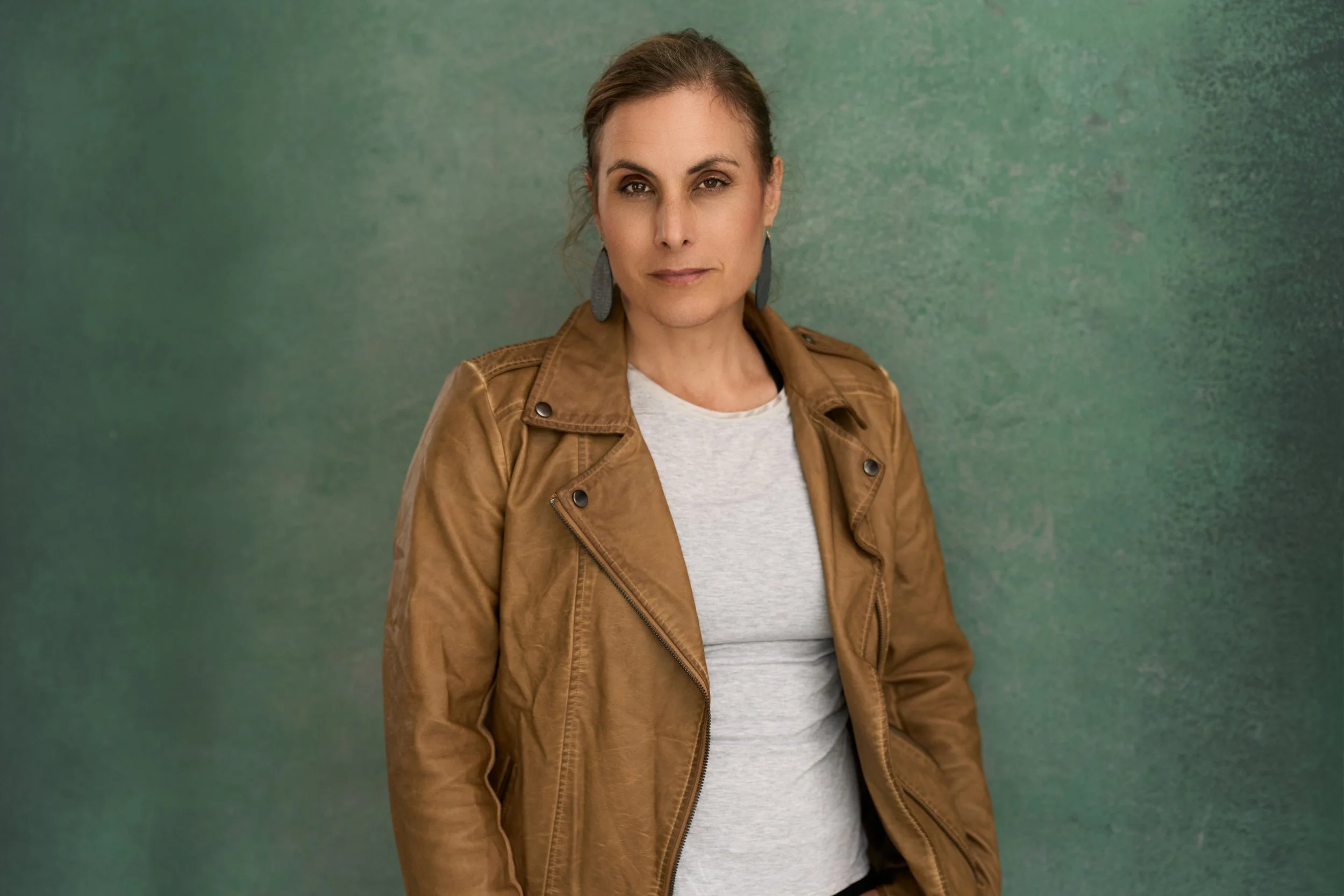
Green isn't a true opposite of my jacket, but it's far enough around the wheel to create contrast while still feeling natural. It's earthy, confident and a little unexpected. If you want to look polished but not like every other LinkedIn profile, green is worth a look.
Neutrals: let the person lead
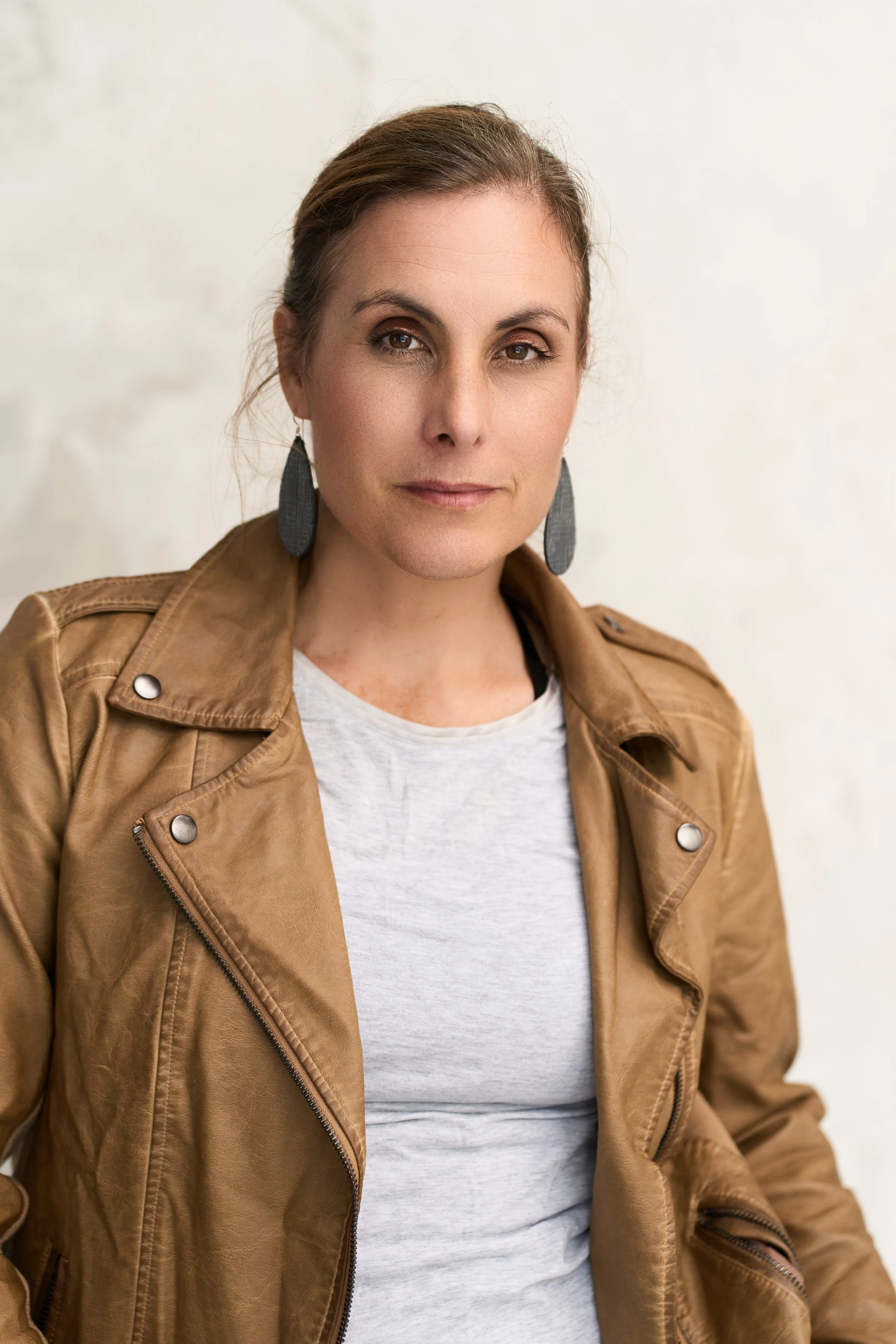
Cream is the quiet workhorse. It's clean and bright, and it works almost anywhere: website, LinkedIn, speaker bio, press kit. When you're not sure where your image will end up, a neutral is a safe choice that still looks intentional.
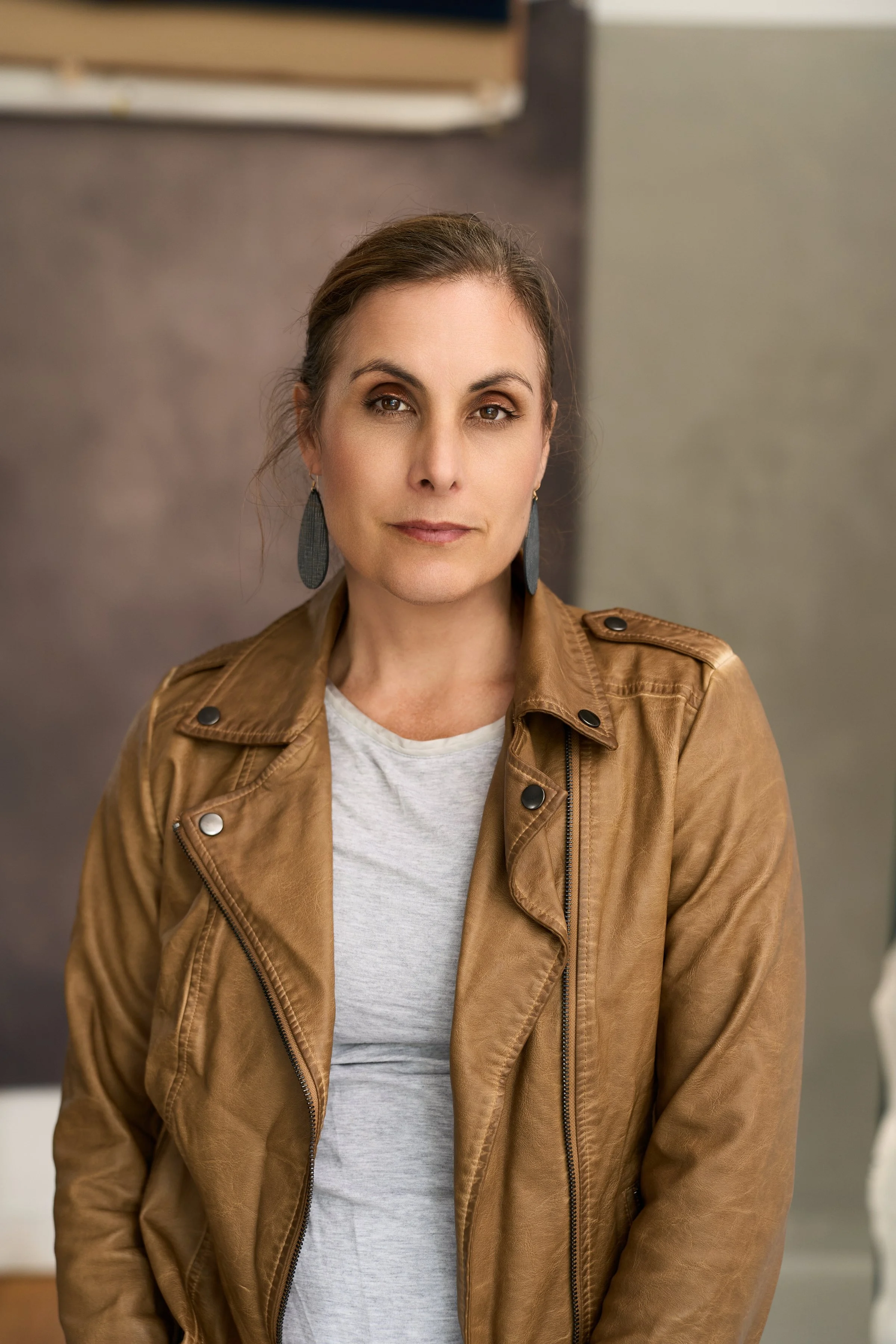
For the last one, I stepped away from the backdrop and into the studio itself. The muted greys and mauves keep it tonal and soft, and the setting adds a little story. This is where branding photos start to show where you work, not just who you are.
The unsung heroes: your basics
Did you notice the grey tee in every frame? That simple neutral layer is doing a lot of work. It bridges the warm jacket and whatever's behind me, and it keeps the focus up near my face. The earrings do something similar. They're a cool slate grey, so they tie into the blue and navy backdrops and add a little contrast against the warm ones.
You don't need a closet full of statement pieces. I didn't bring one. One piece you love, plus a solid neutral layer, will get you a long way.
How to use this when you plan your session
Start with what you love wearing. Confidence shows. This jacket is one I reach for all the time, and I think you can see that I'm comfortable in it. Pick the piece that makes you stand a little taller, and we'll build the color story around it.
Decide how you want people to feel. Approachable? Authoritative? Creative? Calm? Different backdrops send different messages before anyone reads a word about you.
Think about where the image will live. If your website or brand has set colors, bring them. A backdrop that works with your brand palette makes everything look more put together.
Bring options. Two or three tops in different color families give us room to play. Some of my favorite frames come from a combination nobody planned.
Let's find your colors
Photographing myself reminded me of two things. First, color harmony isn't about following rules. It's about making sure nothing in the frame is competing with you. When the backdrop, your clothes and your skin tones work together, all that's left is your expression, and that's the part people remember.
Second, it's a lot easier when someone else is running the camera. You don't have to worry about the lights, the settings or whether the color works. That's my job. Your job is just to show up.
If you're in Topeka, Lawrence, Atchison or anywhere in Northeast Kansas and you want headshots that feel like you on a good day, let's talk. I'll help you choose the wardrobe and backdrop that tell your story, and I'll handle the rest.