
5 Signs Your Branding Photos Are Too Busy (And Why Simple Always Wins)
When people land on your website or scroll past your Instagram, they decide in about three seconds whether they trust you.
Three seconds. That's it.
And here's the thing: they're not reading your bio in those three seconds. They're looking at your photos. Your visuals do the talking before your words ever get a chance.
So when your branding photos are cluttered, chaotic, or just too much all at once, people leave before they ever get to know you. Not because they don't like you. Just because their eye couldn't settle anywhere.
Simplicity in branding photography isn't a style preference. It's a strategy. Here are five signs your photos are working against you, and what to do instead.
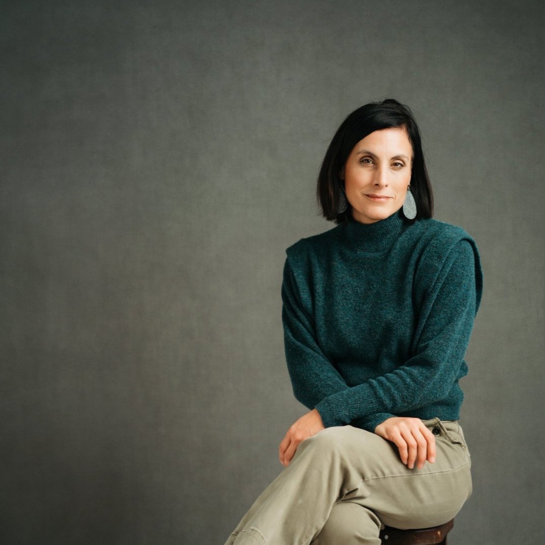
1. Your Background Competes With You
Look at your headshots or branding photos. Now ask: where does your eye go first?
If the answer is anything other than your face, you have a problem.
Busy backgrounds pull attention away from the subject, which is you. Cluttered offices, patterned walls, distracting outdoor scenes, even a coffee shop with too much going on in the background -- all of these divide attention instead of directing it.
Clean backgrounds create visual quiet. They tell your viewer's eye exactly where to look. That's not boring. That's confident.
What to look for: Simple, uncluttered backdrops. Neutral walls, open space, clean brick, soft greenery. The background should whisper, not shout.
2. There's Too Much Stuff in the Frame
Props can be great. A laptop, a coffee mug, a notebook -- these details add personality and context. But there's a tipping point where "authentic workspace" becomes "visual noise."
When your branding photo includes your full desk setup, three plants, a motivational poster, a stack of books, and your pet in the background, no one knows where to look. The story gets muddled.
The most effective branding photos tell one clear story per frame. What do you want people to feel when they look at this image? Strip everything else out.
What to look for: One or two intentional props, max. If you can remove something from the frame and the image still makes sense, remove it.
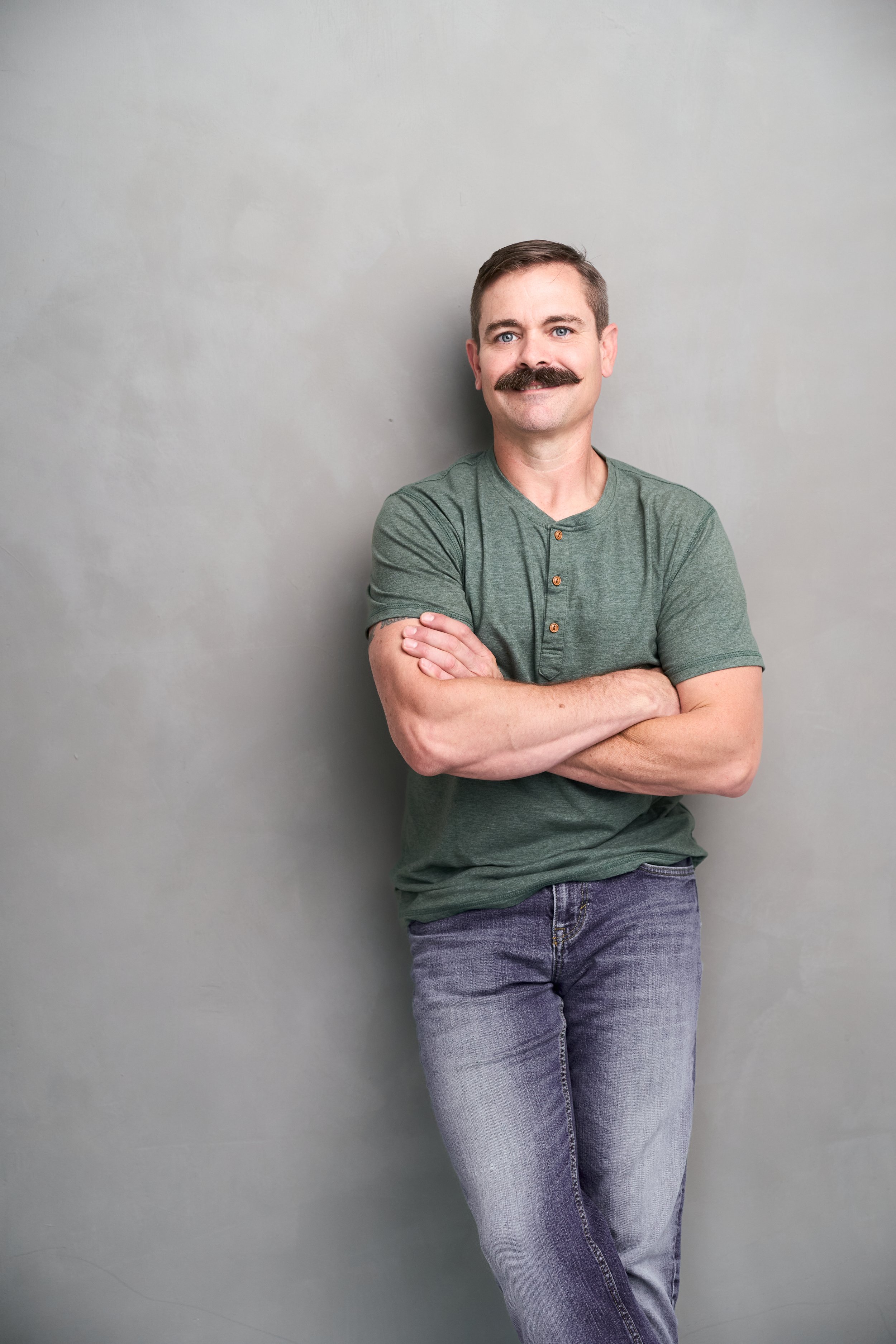
3. The Lighting Is Distracting
Harsh shadows. Overhead fluorescents. Windows behind you blowing out the image. Mixed light sources that make your skin look strange.
Bad lighting doesn't just look unflattering. It makes the photo feel chaotic and hard to look at. People can't always put their finger on why a photo feels off, but bad lighting is almost always the culprit.
Simple, clean lighting is even, flattering, and invisible. It does its job without drawing attention to itself. When the lighting is right, you stop noticing the light and start noticing the person.
What to look for: Soft, even light. Natural light from a window to the side, or professional lighting that wraps around the face. No harsh shadows. No blowouts.
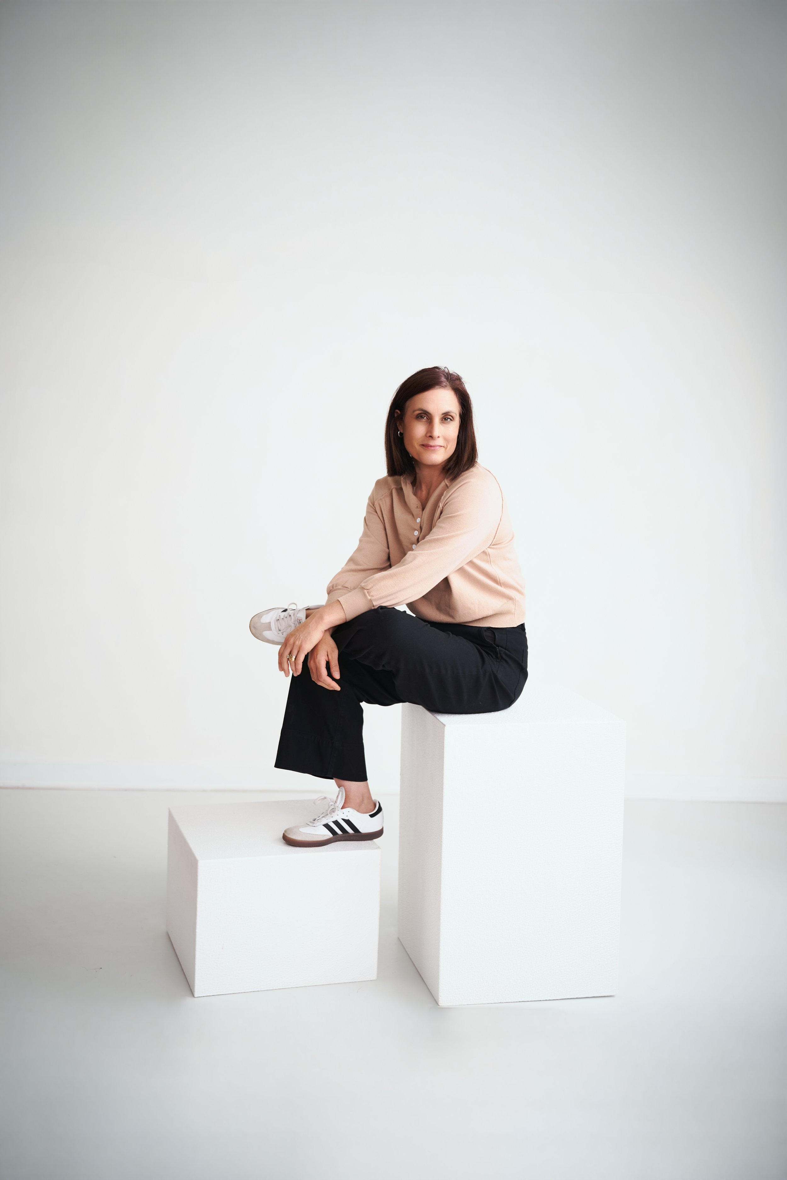
A simple picture gives you options to add headlines, info, and graphics. You have room around you to give you a great canvas to create amazing marketing
4. Your Photos Don't Match Each Other
This one is less about any single photo and more about the full picture.
Open your website. Scroll your Instagram. Do your photos look like they belong together?
If you have one bright, airy image next to a dark, moody one -- or a professional headshot next to a blurry phone selfie -- the inconsistency signals to people that you're scattered. Even if each individual photo is fine on its own, the collection feels unplanned.
Consistent, cohesive photos build trust fast. They show that you're intentional. That you pay attention to details. That you're someone worth hiring.
What to look for: A consistent color palette, lighting style, and mood across all your brand images. When someone scrolls your Instagram grid, it should feel like one curated story.
5. You Blend In With Everyone Else
This one stings a little, but it's worth saying.
If your branding photos look like every other business owner in your industry, they're not doing their job. The point of branding photography is to make you recognizable -- to stop the scroll and say, "That's her."
Generic stock-photo vibes, stiff poses, and forgettable settings make you look like a template. Clean, simple photos that are centered around who you actually are and how you actually work? Those are the ones people remember.
Simple doesn't mean generic. It means everything unnecessary has been removed so that what remains is unmistakably you.
What to look for: Photos that feel like you. Your personality should come through clearly, even in a still image.
What Clean, Simple Branding Photography Actually Looks Like
It's not about being minimalist for the sake of it. It's about removing the clutter so the right thing stands out: you.
Clean backgrounds. Intentional props. Great light. Consistent styling. A genuine expression that doesn't look forced.
When those elements come together, you get photos that do real work for your business. Photos that make someone stop scrolling and think, "I want to work with that person."

Ready for Photos That Actually Work for You?
At Still and Wild, we create branding photos for entrepreneurs and small business owners in Topeka and Northeast Kansas who are ready to show up online with confidence. Every session is intentional, every shot is purposeful, and you'll walk away with images that feel like you and work hard for your brand.
Let's create something simple and stunning.
Still and Wild is a headshot and branding photography studio serving Topeka, Holton, Lawrence, and Northeast Kansas.